The Art of Pricing Strategy
Transforming Value Communication into Sustainable Growth

🏷️ Competitive Pricing
📑 Trade Accounts
📦 Bulk Buying
🛍️ Wide Product Range
“Wait, how much is this?”
We’ve all been there—hovering over the ‘Buy Now’ button, doing mental math, questioning the value.
But here’s the thing: pricing isn’t just an information piece to quickly gloss over.
It’s a powerful UX lever—one that conveys the value of a product, shapes perceptions, builds trust, and, when done right, guides a customer seamlessly toward checkout.

Now imagine the same but now from the perspective of a business procurement officer.
Pricing isn’t just the personal thrill of saving a few bucks.
It’s a strategic lever that often marks the line between a successful day and a stressful one.

They’re not browsing—they’re balancing: strict budgets, urgent timelines, evolving inventory needs, and internal accountability. Every click is calculated.
Can I add more products to this order? Is this the best value across vendors? Can I defend this cost to finance?
This isn’t about impulse buys—it’s about precision and responsibility.
Pricing, in this context, is more than just cost visibility. It's about empowering procurement officers to:
Compare confidently
Plan smarter
Justify purchases
And spot real value in real time
Because for them, a well-designed pricing experience doesn’t just lead to a purchase-it leads to an efficient way of working
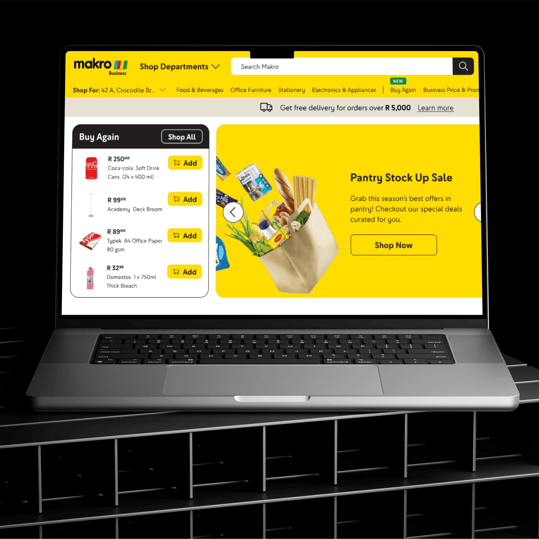
The Current Pricing Strategy
We began by mapping out all the existing pricing types across the website and in-store experience. What we found was a complex ecosystem—especially online—where multiple pricing models coexisted: business pricing, time-bound deals, combos, free gifts, seasonal offers, and more.
This breakdown was crucial. It gave us clarity on how these varied pricing strategies were being presented (or not), and where they overlapped or caused confusion. Our goal? To ensure that each pricing type could stand on its own while complementing the others. The goal was to help users easily understand the benefit of each, compare meaningfully, and make conscious, confident purchase decisions.
🔍 Uncovering Gaps: End-to-End Pricing Journey Audit
Next, we conducted a comprehensive website audit focused specifically on the pricing experience—from discovery to checkout. Our goal was to identify friction points, inconsistencies, and missed opportunities in how pricing was communicated across the journey.
As we mapped this out, we also uncovered key insights and opportunity areas—clues pointing to what users needed but weren’t quite getting.
From this analysis, three major problem themes stood out clearly. These revealed the critical moments where users struggled to interpret value, compare options, or place trust in the pricing they saw.
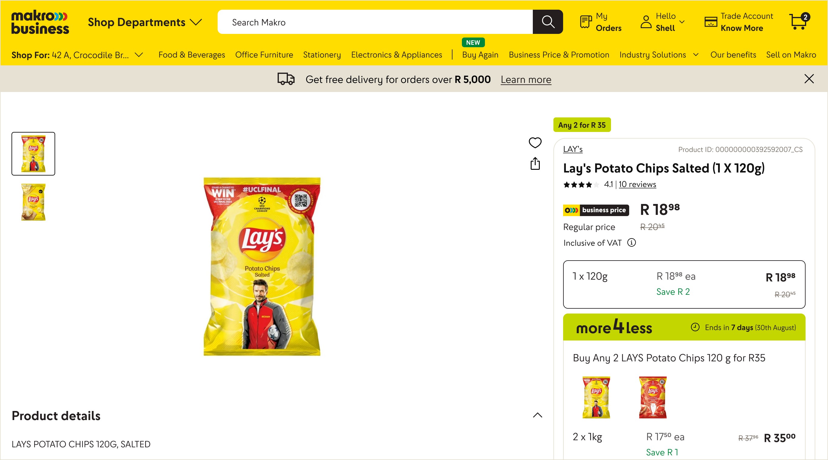
Lack of Key Information
Users often couldn’t find critical details like unit breakdowns, tax inclusion, or clear deal mechanics. Without this, pricing felt vague and unhelpful, especially for business buyers who need full transparency.
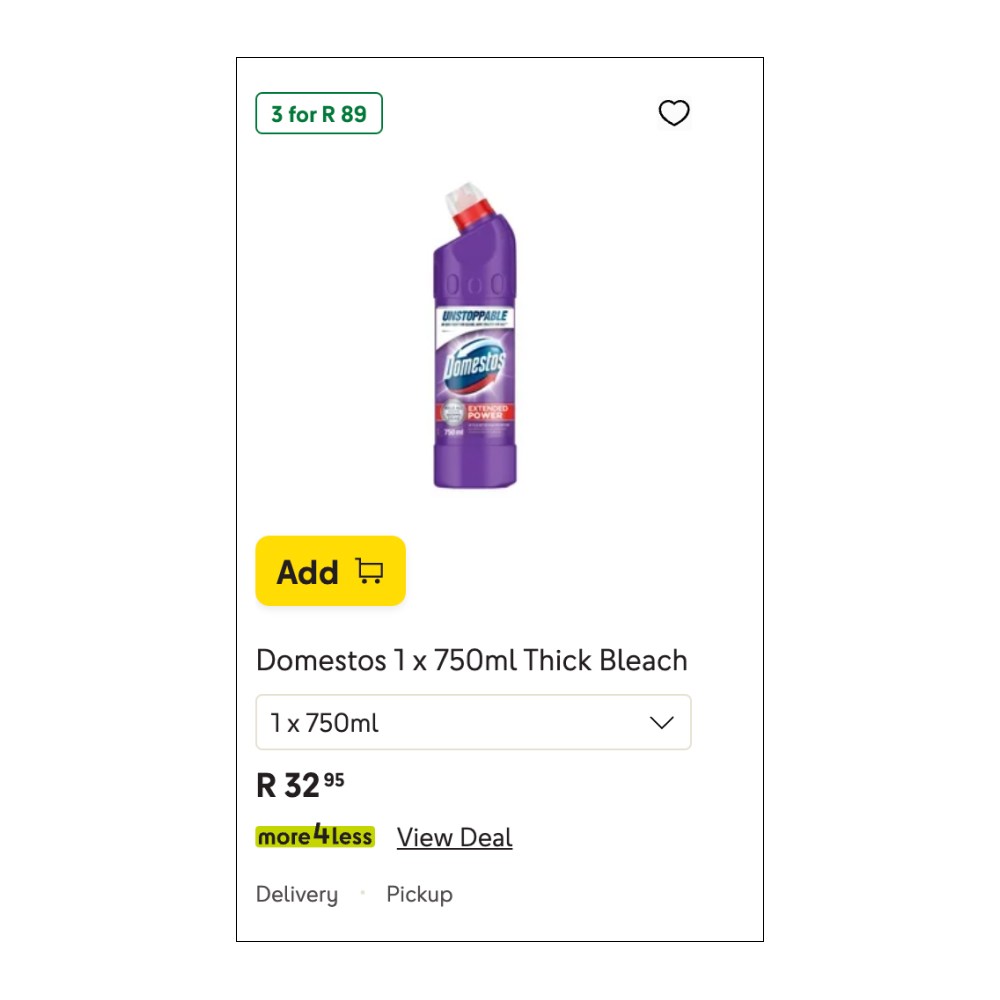
No description thus no incentive given to check deal. Hence users aren't aware to explore or add the deal
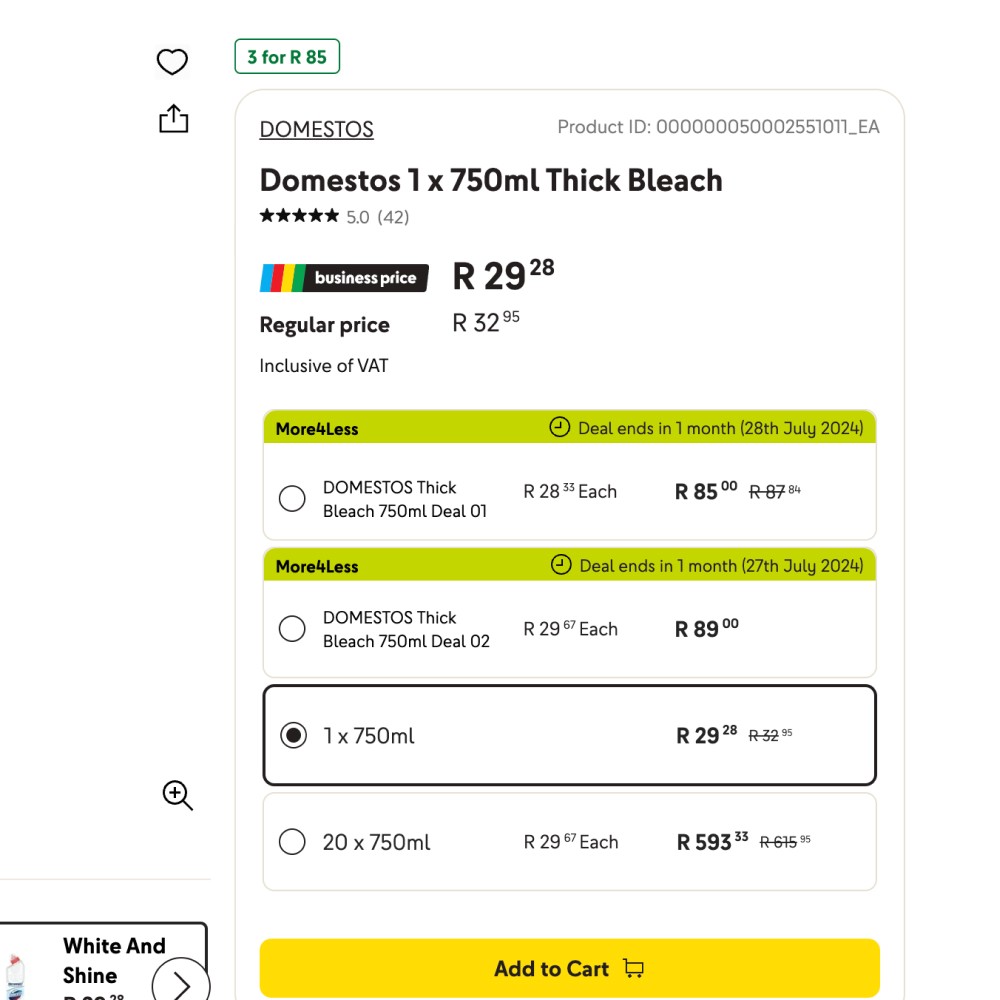
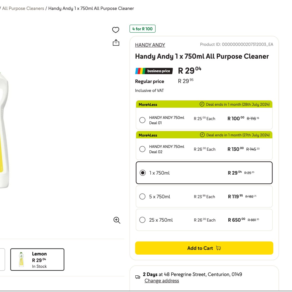
The radio buttons don't showcase when there is a business price on a product in addition to lack of savings
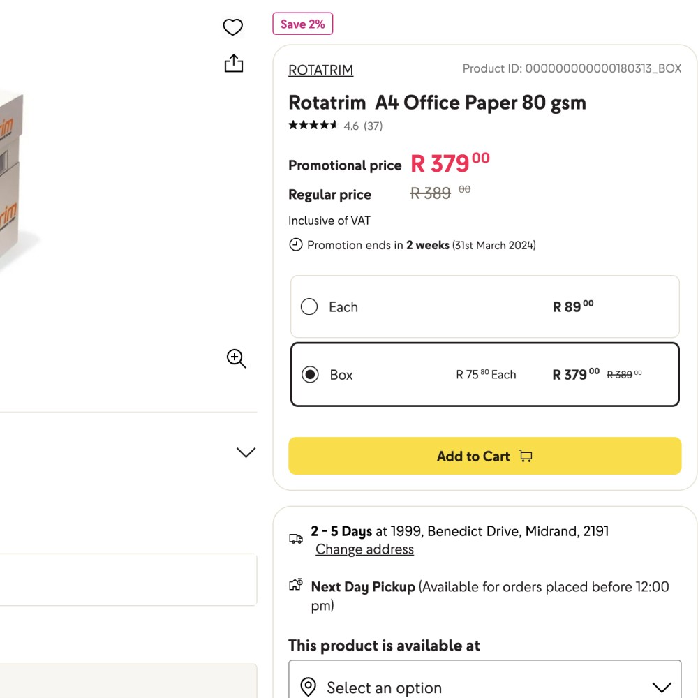
Radio button selection doesnt show original price or savings
User wont be encouraged to opt for promotion or buying higher quantity since they cant see savings on it
Inclusive of VAT isnt key information. Users need to know can they claim tax on product or not
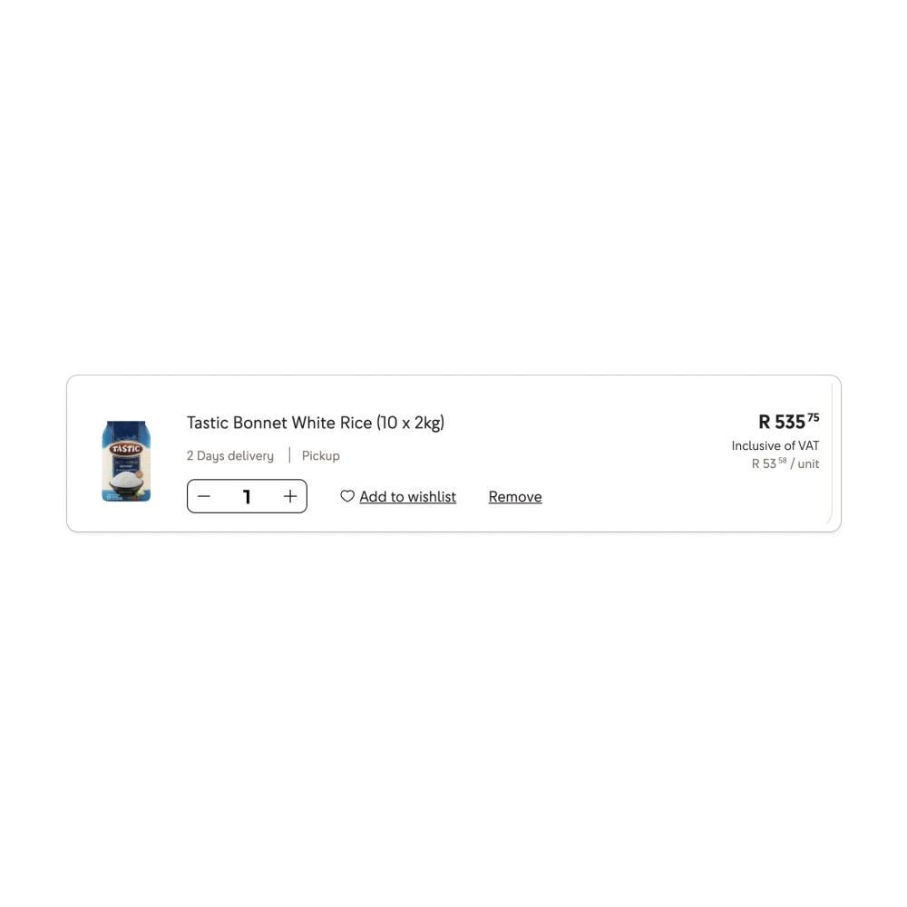
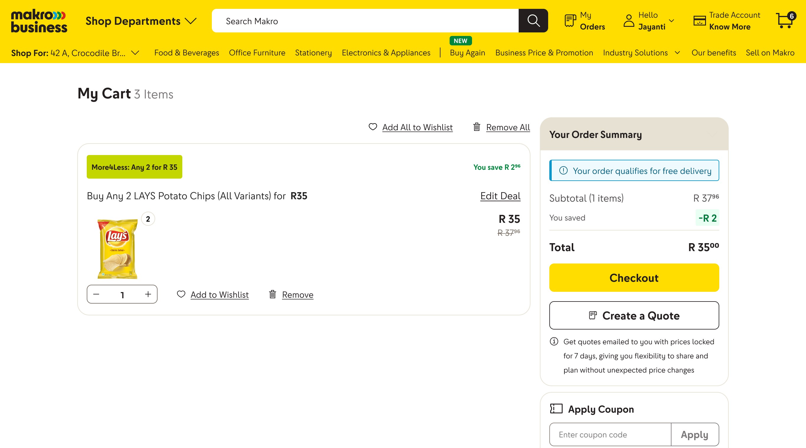
No savings shown when user is at cart
Nor is user guided when they are missing out on a deal
High Cognitive Load
The number of pricing types—business discounts, bundle offers, limited-time deals, all shown together without context, overwhelmed users. Instead of empowering decisions, it made them second-guess and stall.

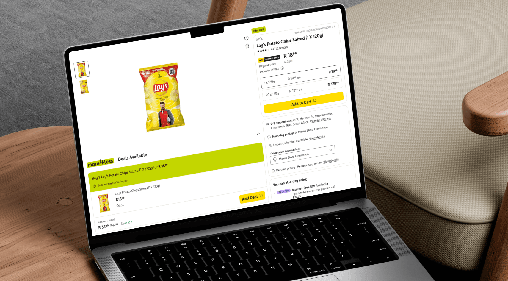
Lack of deal details. CTA existing without context
On click of view deal users are taken to product page where they must hunt to find the deal on the page
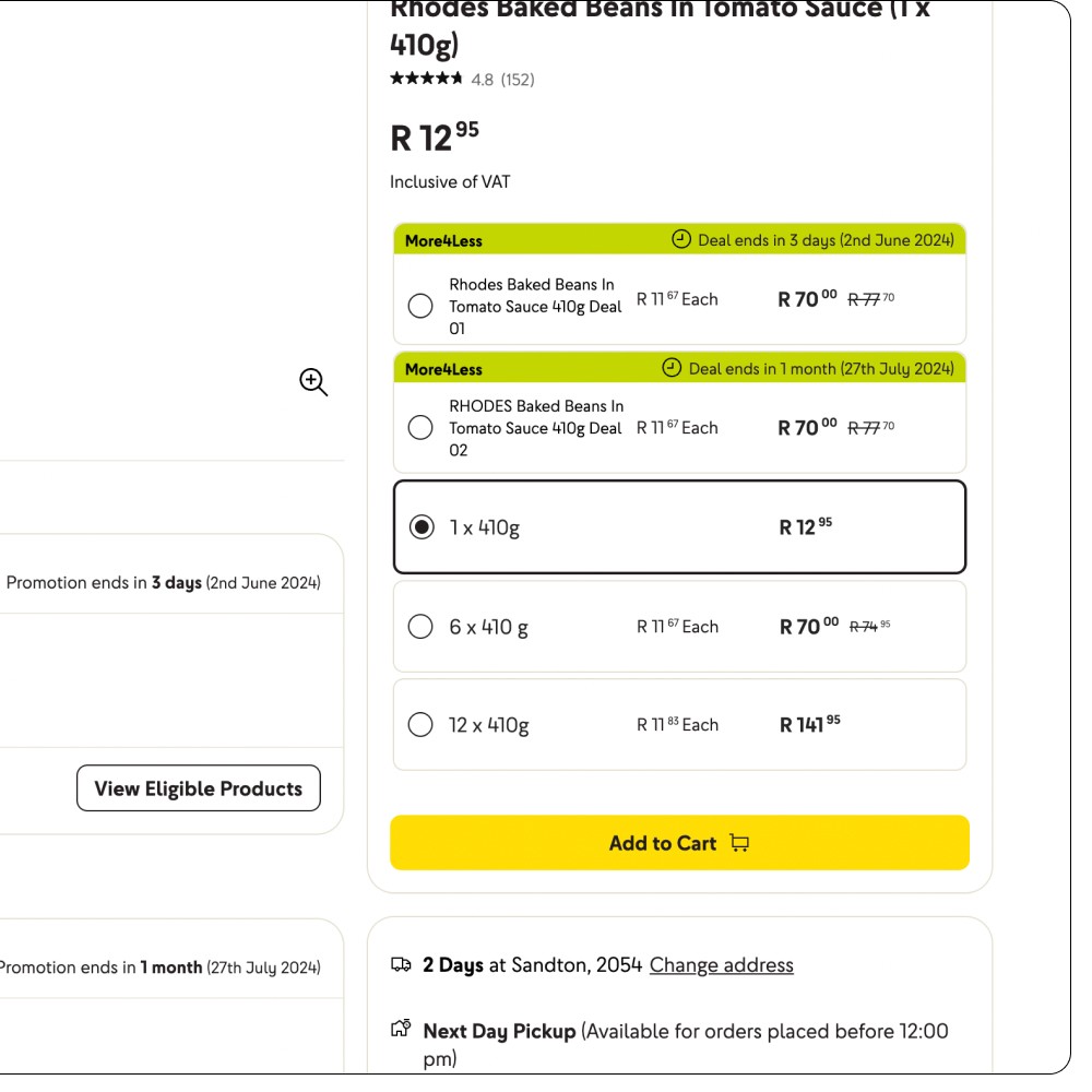
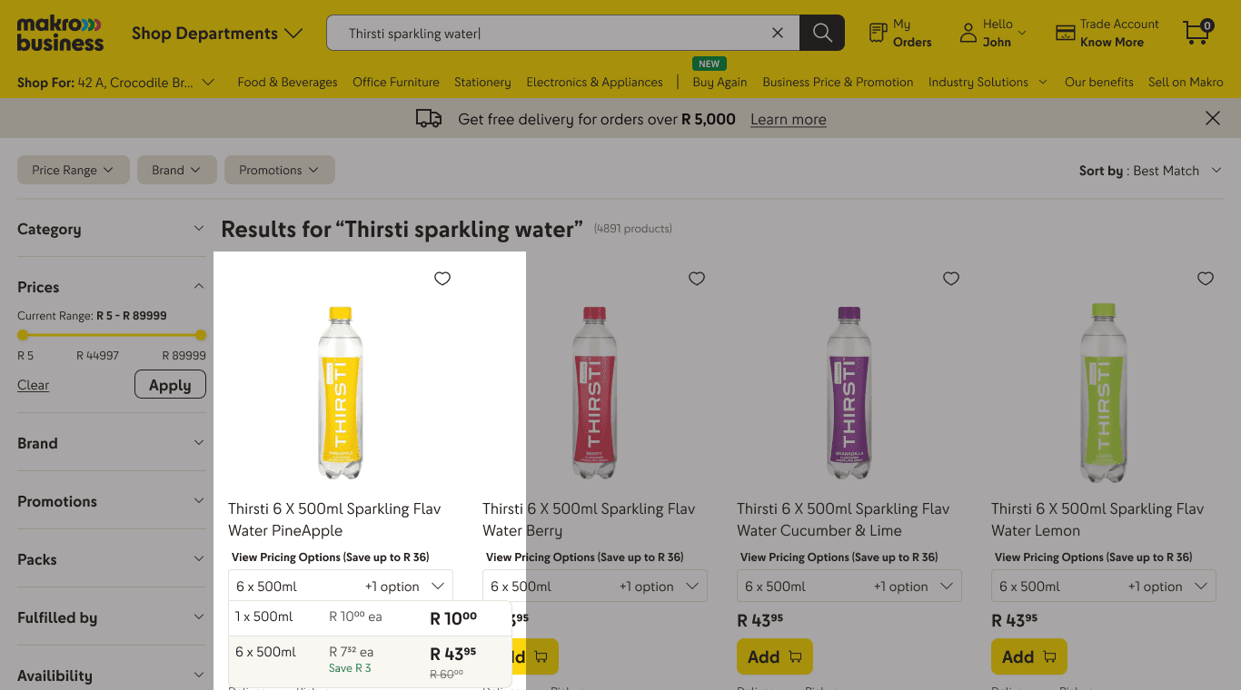
The same kind of offer repeats across different formats often
giving the exact same product at the same price
The duplication of exact same offer in different formats will confuse the user

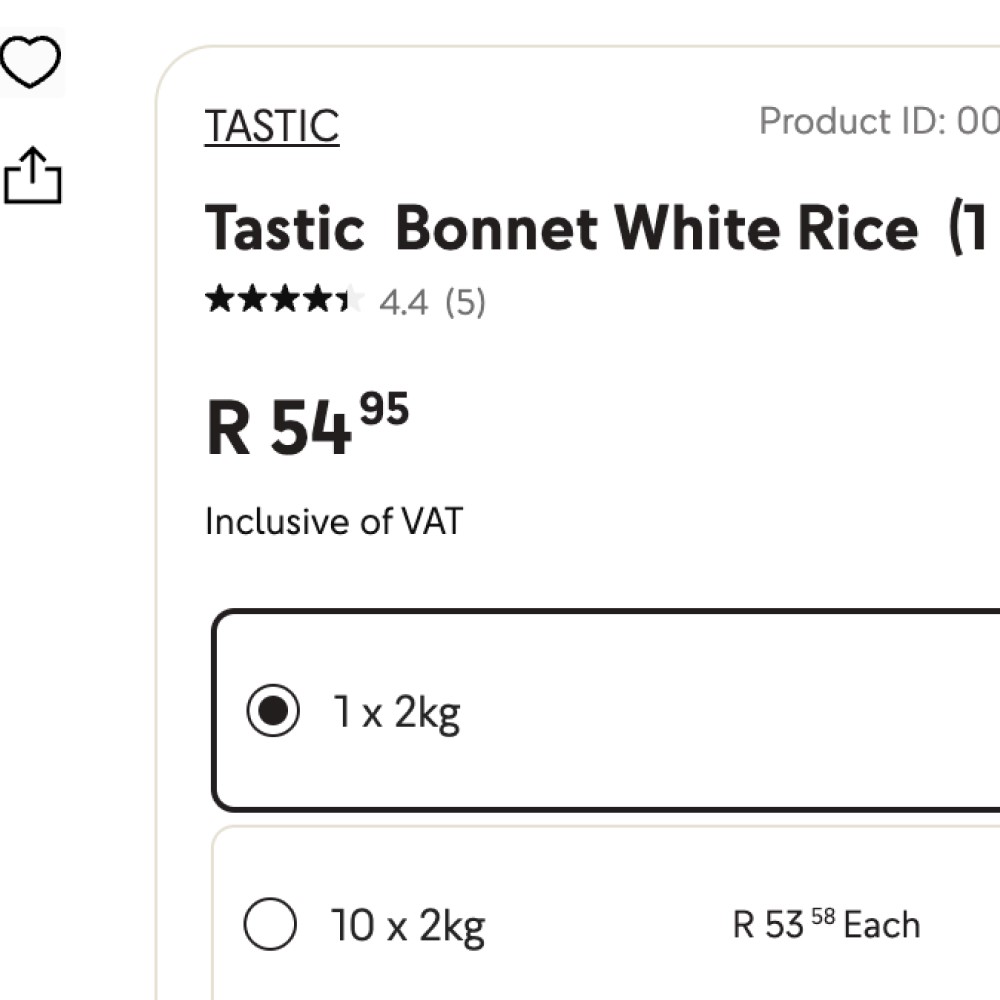
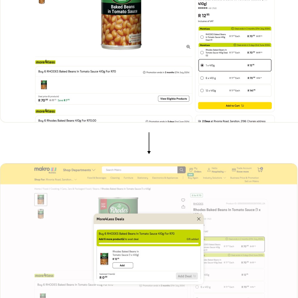
The price per item is hard to compare as different pricing elements are split across columns. (54 and 54 in the image are in different columns)

Deals with different prices and timelines are often loaded together increasing choice and cognitive load
(see image 5 months and 5 day timeline
To add a deal users need to
Click view products
Manually select each item to qualify for deal
Click Add Deal to Cart
Products part of a deal are scattered across cart so its confusing to understand which products were added under which deal
Mistrust on Makro Business from Inconsistency or Misleading Signals
In some places, pricing looked….. just plain confusing. Inconsistencies between list prices, deal tags, and cart totals created doubt. When pricing doesn’t add up, trust erodes fast.
Out-of-stock products are still shown as selectable options for users to add a deal.
More4Less offers a much better offering than business price

Users aren't shown the benefit of bulk purchases which is a business USP
Design First Iteration & User Testing
The initial design iterations were developed within the project scope constraints defined by the product team, focusing on the following key aspects.
✌️
SHOW PRICING BENEFITS
Focus on showing savings on deals, promotions and bulk purchases during and after purchase
🧐
MAKING DEALS EASIER TO UNDERSTAND
Simplifying deal structures for better clarity and easier addition.
🏪
SIMPLIFYING STORE DEALS WHEN LOADED ONLINE
Testing user receptivity to simplifying and revamping the way store-bought deals were loaded online


Conducted prototype testing with 7 users to evaluate how customers understand and perceive pricing across the browse journey—PLP, PDP, and Cart. Findings from both tests informed design improvements before development. The following were testing during Ut's

Prototype A: Showcasing Pricing Benefits
Prototype A showing a clear price comparison between different options with savings and unit price
Prototype B: Making deals to understand
Prototype B involved surfacing deals and their explanation better throughout the journey
Prototype C: Simplifying Store Deals When Loaded Online
Prototype C involved showing a simplified structure for surfacing offline store deals online
💡 Insights gathered for final design

Product information and savings benefit need to be clear and consistent

Increase awareness of the business site and its pricing benefit

Pricing deals that are too complex wont be added by users even if it provides a good pricing benefit

Deals need to be have improved descriptions and addition process
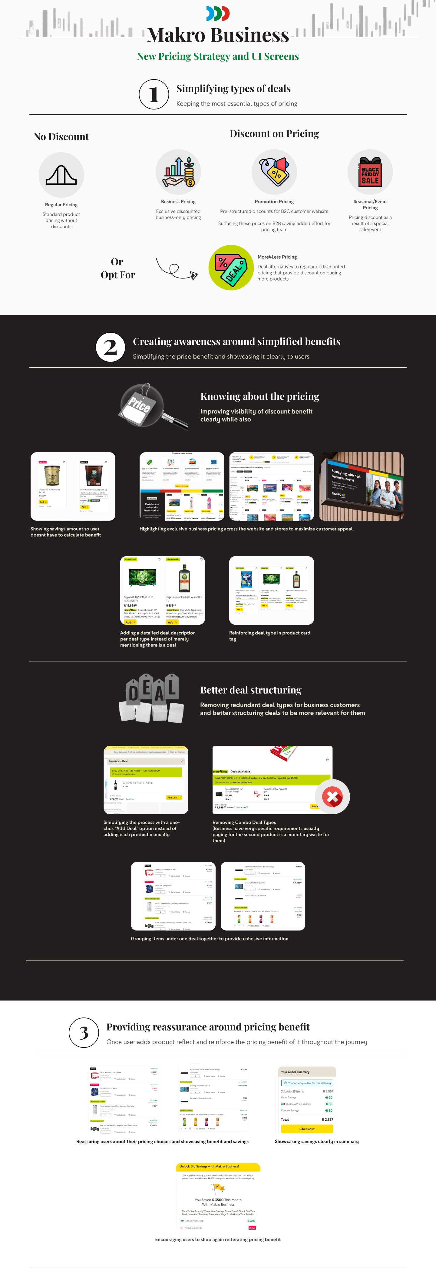


IMPACT
AFTER
RELEASE
5.26 %
increase in add to carts
2.8 %
increase in add to cart sessions
1 %
increase in searches