
🔎
🧪
⚙️
🗺️
📋
⭐
🚩
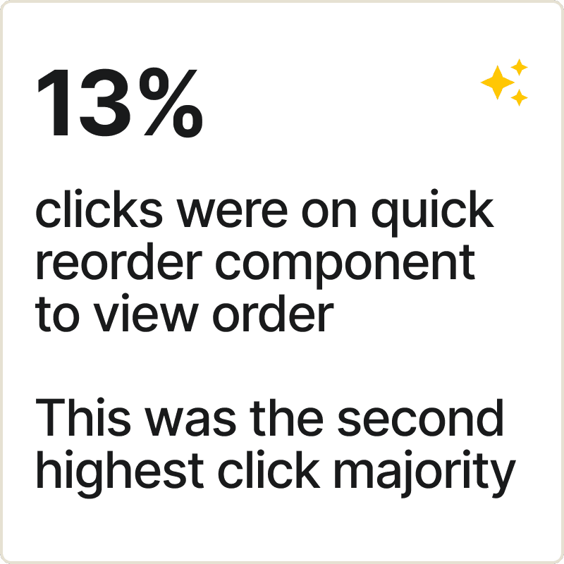
MVP Impact
generated through the feature
in Add to Cart rate, indicating higher user engagement and intent to repurchase


🏷️ Competitive Pricing
📑 Trade Accounts
📦 Bulk Buying
🛍️ Wide Product Range


The Hypothesis
Improving 'Buy Again' feature leverages customers' existing purchasing habits and will reducing decision-making friction and encourage repeat purchases, ultimately driving revenue growth.

Relevance for Users
Businesses shop based on necessity, following structured procurement lists and predictable reorder patterns. The "Buy Again" feature would streamline restocking by reducing cognitive load and enhancing efficiency.

Experience Objective
Give users the power to repeat a purchase with least effort

Test 1 Overview
September 2022- June 2023
To test the effectiveness of the "Buy Again" concept, a reorder component and a buy-again carousel were introduced on the homepage.
These two distinct approaches to facilitating repeat purchases were implemented to evaluate user preferences and determine which method better aligns with their shopping behaviors.
About the Components


Test 2 Overview
October 2023- April 2024??
With growing emphasis on the "Buy Again" feature, targeted enhancements were introduced within technical constraints :
A Buy Again-focused component was strategically placed in a high-visibility area on the homepage.
A dedicated Buy Again page was created, accessible via a "View All" link for an expanded experience.
A repeat order component was added to the "My Orders" page for seamless reordering.
About the Components
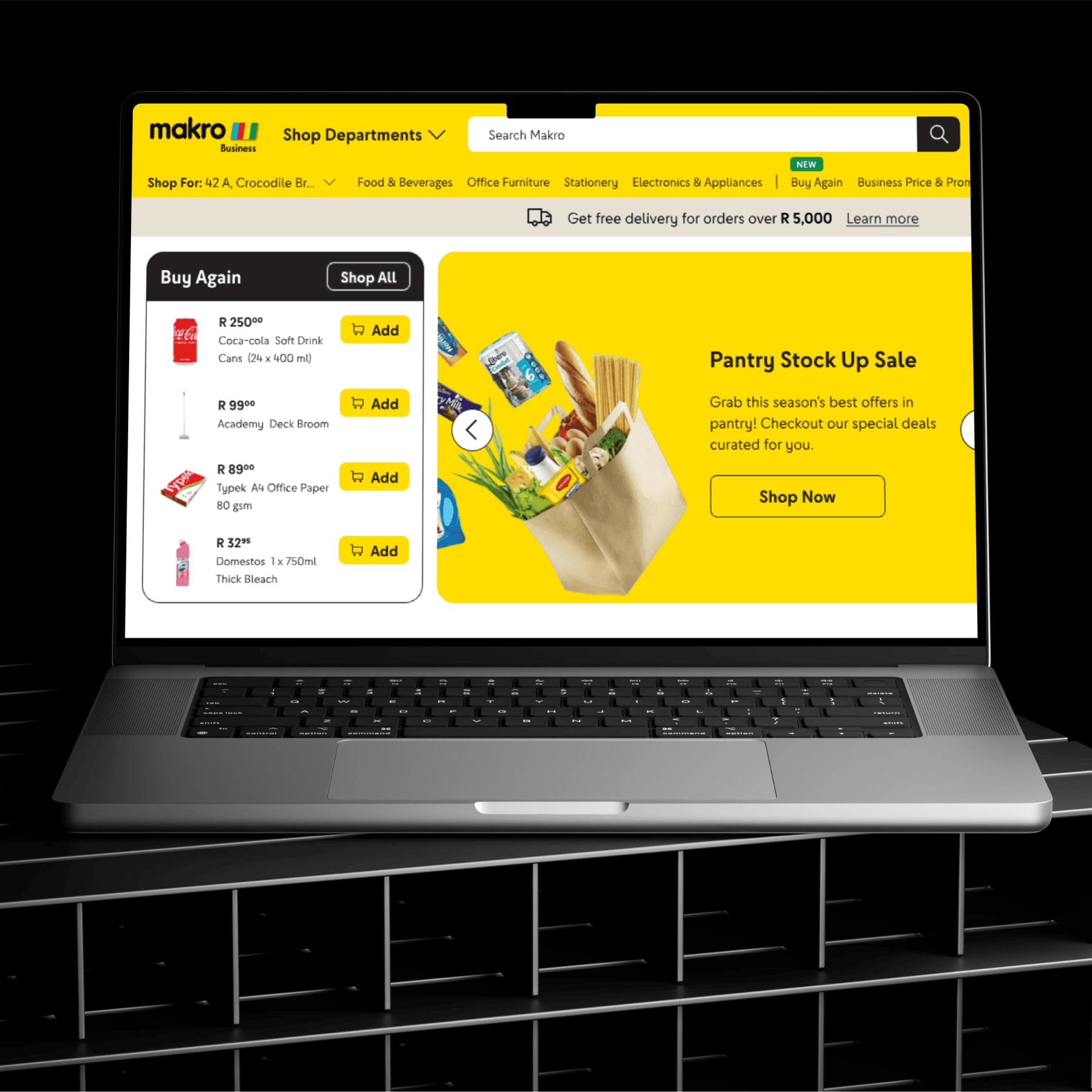
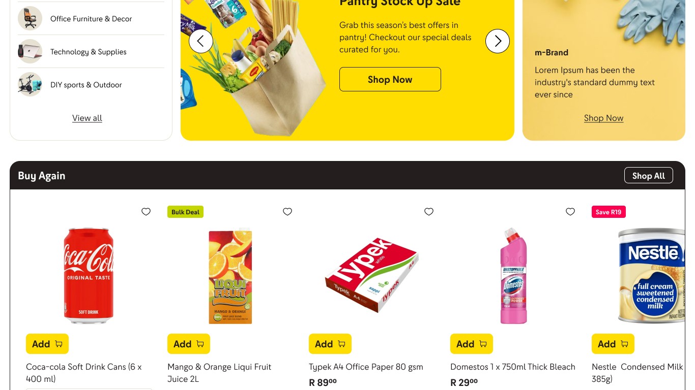
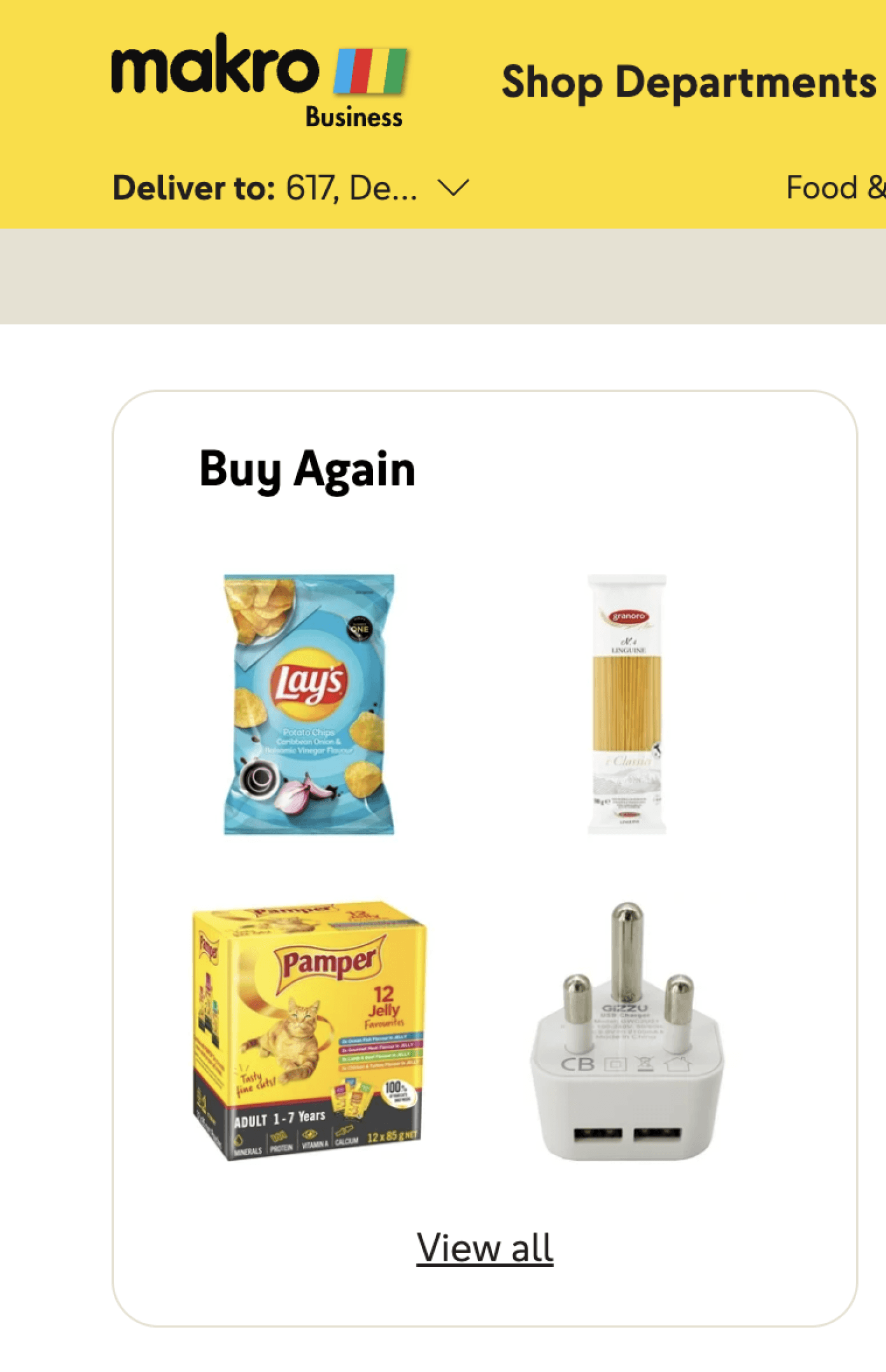
Buy Again Section
Showcased images of products that were previously ordered
Repeat order button on my orders
When clicked, this feature adds all products from the user's previous order to the cart, maintaining the exact quantities from that order


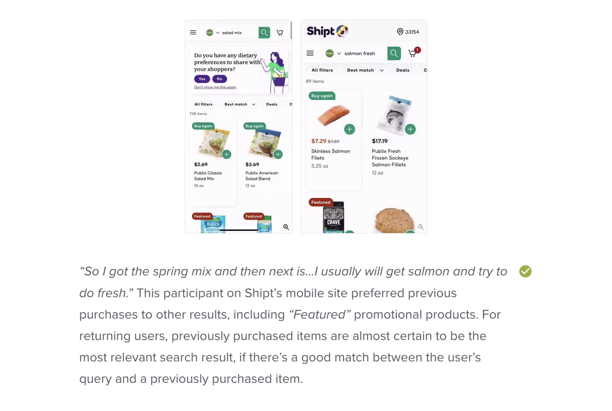
Competitor Benchmarking Research
Main Insights from Competitors
🔎
DISCOVERY
More Entry Points
📝
ACCESS
Buy Again Page
🔔
REMINDERS
History


Research Insights from Baymard


🖼 Scenario
🎯 Goals
😥 Pain Points
Not knowing buy again existing as a feature on Makro Business
Not being able to easily add previously bought items

A summary from the customer journey map
Problems
A summary of the key problems
Communication channels (email, messages) do not promote or inform users about the repurchase feature.
Users experience difficulty locating previously ordered items.
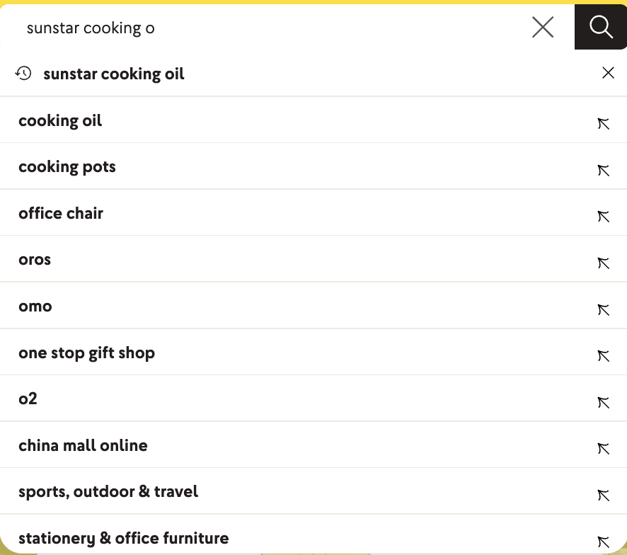
Previously purchased products are not prioritized in search results.
Reordering is restricted to the order level, limiting flexibility for individual item selection.
Previously bought products are not highlighted during the browsing journey.
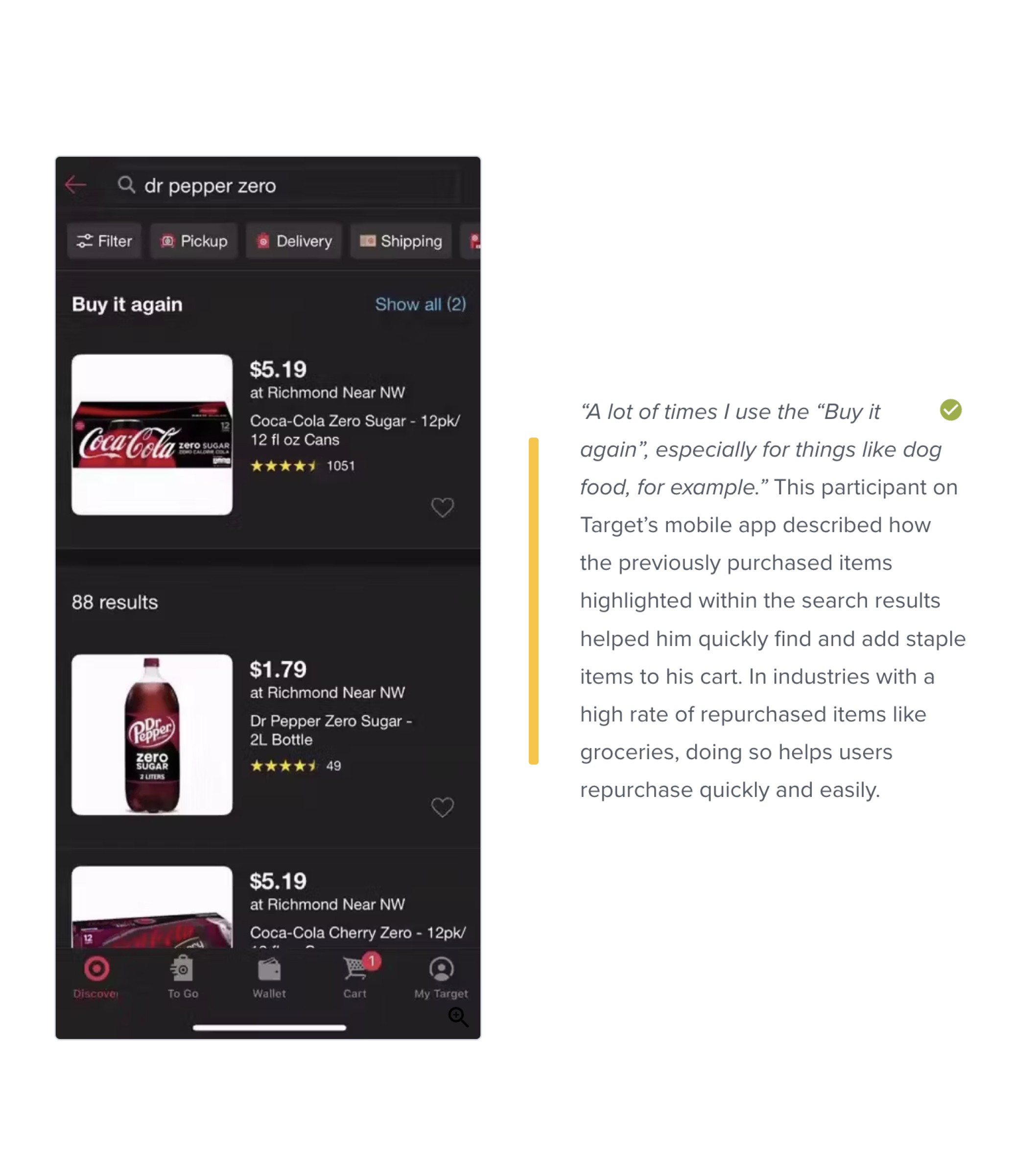
The "Buy Again" component provides only image references, lacking essential product details. The "Buy Again" section lacks comprehensive product information, limiting its usability.
Opportunities
Points to target for the redesign
Highlight the "Buy Again" feature and previously bought items with improved communication and banners.
Add detailed item-level information, including purchase context, for easier reordering.
Enable flexible reordering at the item level instead of order-level only.
Simplify navigation to “Buy Again” through improved header links.
Prioritize previously bought items in search results and add filters or indicators for past purchases.
Explore a subscription model for frequent, repetitive orders.


Version A

Version B
They would click reorder then manually update the items in cart everytime
Large Corporate Existing Customer
"I find the last order I did in the previous month and just click reorder"
Discoverability improved for
buy again page
Customers responded best to snapshot view of buy again and header link. The carousel wasn't noticed much
Ryno
B2B Hospitality Customer
" I like this much more because you can actually see it on the page"
Charmaine
Corporate Existing Customer
Didnt notice the Buy Again carousel in version B and found the link easily in navigation
Version A: Difficulty adding products from list view
Users felt it difficult to add quantity in bulk with a separated add to cart. It didn't aid the bulk purchase process neither did customers feel a need for the feature and found it confusing
Mokgadi
Corporate Customer
Isn't clear on the actions to select a quantity and add to cart before selecting next product. User prefers B Version
Vangile
Corporate Existing Customer
"I have added everything to cart no no I haven't added"
(forgot to press add to cart in version A and just selected quantities)
Version B: Shopping Page View for Buy Again
Customers responded well to this version and found it familiar
The ability to purchase bulk in one go was something they didn't feel a lack or need for and were happy with the functionality offered by version B
Ryno
B2B Hospitality Customer
Added items easily and was able to notice the deal callouts as well
Vangile
Corporate Existing Customer
The B prototype shows me more business related items more close to what i buy (items were exactly same in both versions but user felt a bias towards B)
Jenny
Education Existing Customer
Easily flows through adding the items from the PLP as it feels like shopping

Users found the current experience difficult and were most were unaware of a buy again and using My Orders

Prioritising familiarity by creating a layout similar to a shopping page not list view

Deprioratizing bulk purchase in one click (users didnt show an affinity for the feature) and the info od previous quantity purchased

When questioned on whether users would be interested in a subscription model the responses were positive.
The users valued all the added product information provided on version A was valued by users

PREVIOUS DESIGN
No descriptor about the product being sold only image to guide user
No action for user (CTA) to click if they like the product
Not enough exposure of the buy again items for user to be interested


THE REDESIGN
Option A: Adding the item title and price two very important chunks required for a purchase. Adding a CTA so the user can take action
Option B: If the first option isn't enough exposure a full length carousel could also result in more purchases
Your favourite" tag added as persuasive copy to pursuade the user to buy through familiarity
Shop All Link added to have an entry point to buy again page

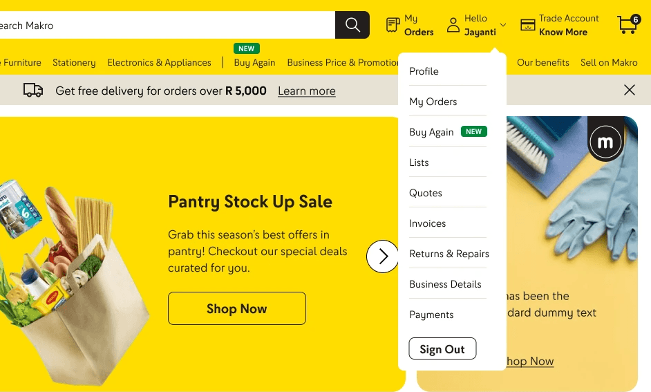
Old Header View
PREVIOUS DESIGN
No entry points or awareness to buy again page on main header
No way to access buy again even through profile (most common section in which buy again usually rests)

New Header View
THE REDESIGN
Buy Again Link given highest priority after category links for a logged in user
Access point added for buy again page under profile
PREVIOUS DESIGN
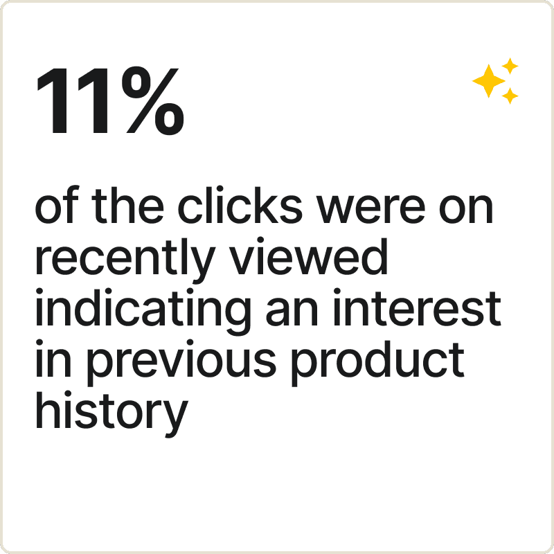
No indication whether user has previously bought a product
x % users click on search once on the website so its a missed opportunity of signalling to users

THE REDESIGN
Including signalling when a product was previously purchased and prioritising it in search
Signalling of when a product category was previously purchased when user does a more generic category based search
PREVIOUS DESIGN
No identifier or prioritisation of previously bought items
Users lack context of previous history during browse journey

Old PLP View

Old PDP View

New Design
THE REDESIGN
Added Tag of "previously purchased" and filter for users to quickly filter to previous purchases
Product Page has added information of previous purchase with context of previous purchases, mode of purchase and date for easier recall value to user
PREVIOUS DESIGN
Not enough entry points to this page to get substantial traffic
User cannot select other options available for this product
(the exact variant that was previously bought is displayed)


THE REDESIGN
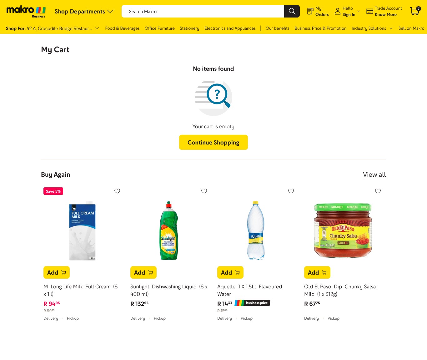
Dedicated page added for buy again under profile
Created buy again as a shoppable page based on user test result preference as customers find the products more accessiblea and familiar to the usual shopping pattern
Entry point into subscription model- a new idea that would be relevant for B2B allowing users the flexibility of reorder without having to put the effort everytime
Business Value Proposition of subscription conveyed upfront as well on banner
In addition, the stepper method is the easiest to add multiple of a product making bulk purchases easier with all options at users disposal
Entry point to reorder to cater to the minority users who want to reorder at an order basis
Filters and sort options added for a conveniant browsing experience like PLP
Smart Saver Option gives intuitively calculates what purchase option is best for them utilizing previous purchase history for that product


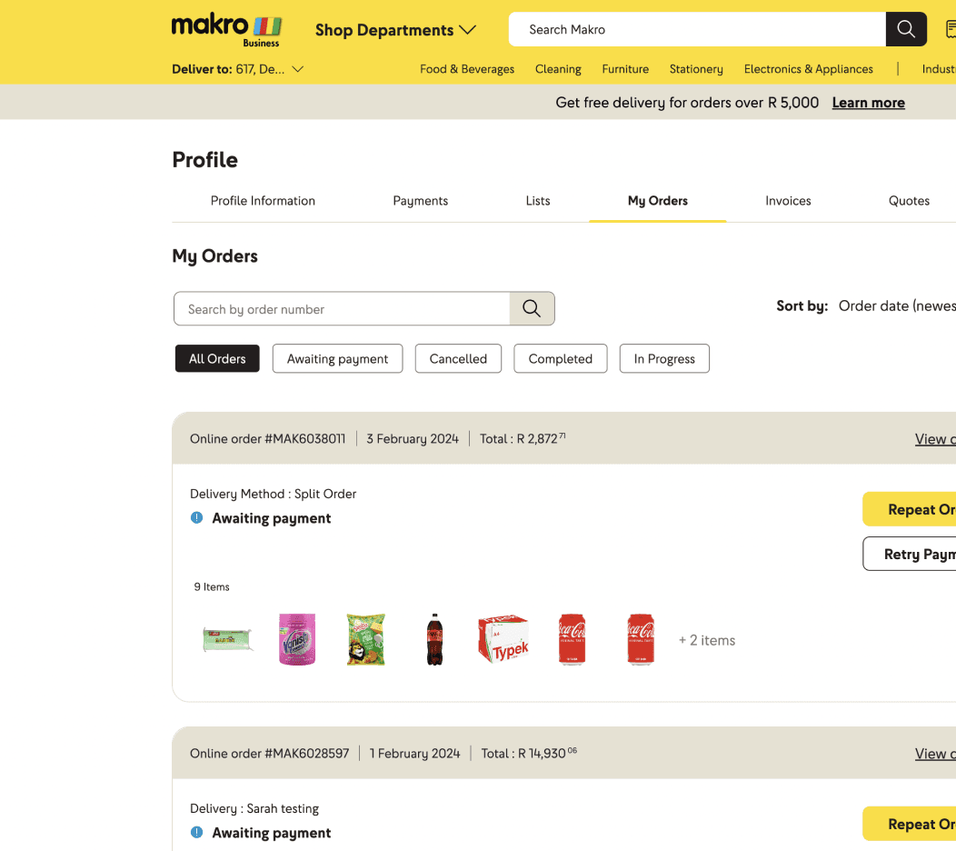
Old My Orders View
PREVIOUS DESIGN
On clicking reorder user gets all items from previous order added directly to cart without having a view of what items are being added
User needs to go to cart to understand what items have been added and in which quantities


Old My Orders View
THE REDESIGN
On click of reorder user gets. a view of what products are being added
User can easily modify items to be added and their quantity through the addition of a checkbox and stepper respectively


PREVIOUS DESIGN
The Problems
No comms or personalised recommendations currently nudging the user back into the shopping journey creating a lost opportunity
No offline touchpoint informing users of this key feature
THE REDESIGN
What was Fixed
Utilising the current infrastructure of email and messaging to inform users of previously bought products and sending reminders in case of inactivity
Adding a personalised carousel at cart where users have high probability of adding the product
Offline Banners to be handed out to customer after check out in store (they shall be able to access offline purchase history as well)

9M Zar
of revenue generated
7% of
increase in add to cart

Homepage: Adding product info, add to cart
cta, link to buy again page

Buy Again Page: Info like purchase mode, date and quantity added
Store purchases reflecting
Navigation: Adding entry point on header
and embedding under profile
Cart: Including a buy again carousel


Old PDP View