🔁 Simplifying repeat purchases for Makro Business
Simpler reorders, bigger returns. A story of generating ZAR 9M revenue and 7% more Add-to-Carts

📅 Project Date
April 2024
🏷️ Project Type
Product Design
UI Design
👤 My Role
Qualitative & Quantative Research
Conceptualization
Design
Dev handoff

FYI: This is a concise project overview. Interested in a detailed case study? Explore it here

🏷️ Competitive Pricing
📑 Trade Accounts
📦 Bulk Buying
🛍️ Wide Product Range
Lets step into the business customer's shoes
Every day, your operations depend on getting the right products, at the right time, in the right quantities. You’re not shopping for fun, you’re shopping because you need to.


Your procurement team follows strict lists. They make fast decisions, driven by necessity, not desire.
Any additional time they take searching, clicking, and rebuilding carts? That’s time and money wasted.

Data Discovery: Reordering Was a Habit
From data analytics I discovered that our online repeat purchase customers aren’t casual shoppers —
they’re businesses with structured buying patterns and high-value needs.
On average, their basket value exceeds R 7,000 (~$370 / ₹30,800).
I noticed many were buying the same set of products repeatedly.
Between January and March 2024,
30% of all items purchased by repeat customers were reorders of products they’d bought before.
That’s nearly 1 in 3 items bought based on habit and familiarity
The data insights
🔄
67% of habitual customers' carts = repeat items
👥
7% of users averaged R7,321 per basket
🏆
It was a small and valuable segment with high revenue impact


A Look 🔙 at the Old Design
The main problem in the previous journey was the lack of entry points to the buy again feature. No awareness about the buy again as feature due to it also not existing at intutiive touchpoints in the journey.
An overview of the current issues
❌
Homepage
No descriptor about product. Only image to guide user. No CTA to encourage action in case user likes the product
❌
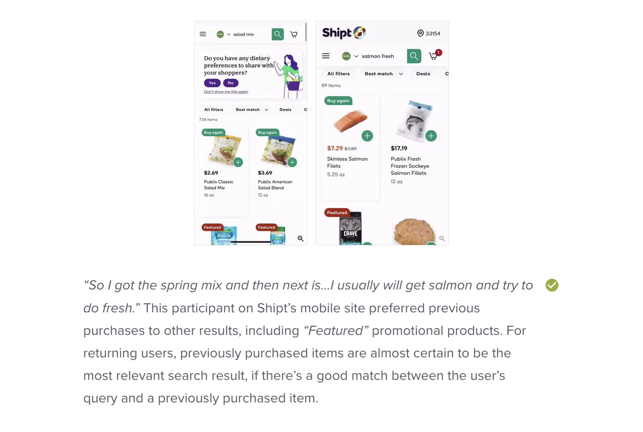
Search
Highest engaged with component. 60% add to carts originate from search. No indication of or nudging towards previously bought items.
❌
Product List Page
No identifier of previous purchases. No prioratization of previous purchases as well crucial during the browse journey
❌
Product List Page
No identifier of previous purchases. No prioratization of previous purchases as well crucial during the browse journey
❌
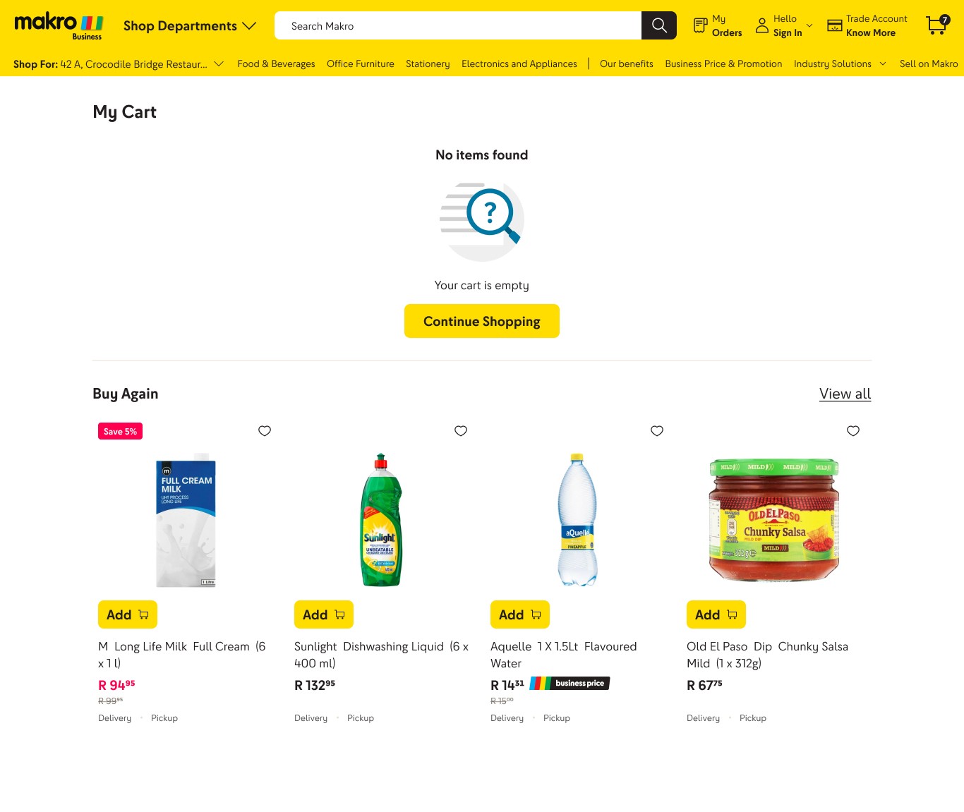
Buy Again page ( very crucial)
Not enough entry points to this page to get substantial traffic. The page requires substantial scrolling to view the entire list.
❌
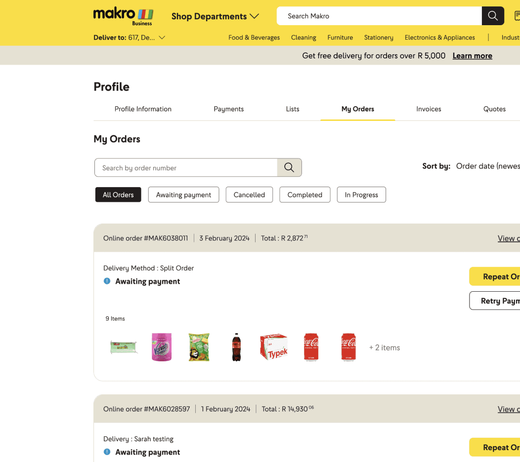
My Orders
Not enough entry points to this page to get substantial traffic. The page requires substantial scrolling to view the entire list. Users current behaviour from previous user testing showed that in order to repurchase users would go into my orders> hit reorder on entire order> go to cart> adjust quantities and items> checkout
This was a long and cumbersome process
Homepage

Search
Product List

Main product page

Buy Again page

My orders

2 Experiments: Gauging Customer Response
We ran two tests with limited tech implementation, deploying reordering features on the homepage to measure performance and validate customer interest. This would help confirm the value of a full-fledged journey.
Test 1: Introducing Buy Again and Reorder Components
📅 September 2022- June 2023
We started small with two experiments:
➡️ Reorder Component: Users could view a previous order and reorder from My Orders, but only by clicking through several steps.
➡️ Buy Again Carousel: A component on the homepage, showcasing individually re-purchasable products from past orders.

The results? Out of an average of 3354 clicks
📊
65% of the clicks were on buy again component, making it the most engaged feature on homepage
📊
13% clicks were on quick reorder component to view order
📊
11% of the clicks were on recently viewed indicating an interest in previous product history
Test 2: Giving Buy Again Prime Real Estate on Homepage
📅 October 2023- April 2024
➡️ We moved the Buy Again carousel to the homepage, above the fold
➡️ Added a dedicated Buy Again page, accessible via a “View All” link
➡️ Introduced repeat order options on My Orders, allowing entire orders to be added to the cart in one click.

The results from the second test?
📊
1.8% of all current cart adds resulted from homepage buy again
📊
1.03% of total logged in sessions went to buy again page
📊
38% of buy again visits resulted in cart adds

The "Buy Again" component clearly stood out, driving strong engagement and repeat purchase behavior. However, the journey was limited by just one effective touchpoint, and the Reorder flow remained cumbersome—forcing users to navigate deep into "My Orders."
Research Tool 1: Unlocking 🔓 Competitor Reorder Strategies
I led competitive benchmarking across 8 platforms, focusing on Indian and international B2B retail sites

Research Tool 2: Looking 👀 out for best practices
Next, I turned to Baymard Institute’s repository—a goldmine of UX insights from over 900 eCommerce websites. I focused on retail, B2B, and global marketplaces, as these closely mirrored the structure and customer behavior of the Makro Business platform. This helped discover proven patterns and identify opportunities to improve the reorder journey.


Recommended practices and insights from secondary research


Research Tool 3: User Testing out a preliminary design
Secondary research gave me direction and helped me create a journey map and initial designs. But something was still missing: the voice of our users.
At this point, I had two design variations on my Figma board and needed real feedback to move forward confidently. With support from the research team, we conducted user testing with six existing Makro Business customers—all of whom had reordered before. Their insights helped us choose the design forward.
Big shoutout to them for shaping a better product with us! 💛

Mokgadi
B2B : Corporate Existing Customer

Jenny
B2B : Education
Existing Customer

Charmaine
B2B : Corporate
Existing Customer

Vangile
B2B : Corporate
Existing Customer

Ryno
B2B: Hospitality Existing Customer

Tiana
B2B : Big Corporate
Existing Customer
Version A

➡️
Snapshot Buy Again view on the homepage
➡️
List view on the landing page, showing quantities, mode of purchase, saving tip
➡️
Bulk reorder options
Version B

➡️
Full carousel on the homepage
➡️
Shoppable PLP-style page with familiar browsing behaviour, showing date prucased and mode

Users loved the familiar shopping page (Version B)- it felt intuitive
Customers responded well to this version and found it familiar
The ability to purchase bulk in one go was something they didn't feel a lack or need for and were happy with the functionality offered by version B
Ryno
B2B Hospitality Customer
Added items easily and was able to notice the deal callouts as well
Jenny
Education Existing Customer
Easily flows through adding the items from the PLP as it feels like shopping
Vangile
Corporate Existing Customer
The B prototype shows me more business related items more close to what i buy (items were exactly same in both versions but user felt a bias towards B)

Bulk reorder (Version A) wasnt needed, they preferred adding products individually
Users felt it difficult to add quantity in bulk with a separated add to cart. It didn't aid the bulk purchase process neither did customers feel a need for the feature and found it confusing
Mokgadi
Corporate Customer
Isn't clear on the actions to select a quantity and add to cart before selecting next product. User prefers B Version
Vangile
Corporate Existing Customer
"I have added everything to cart no no I haven't added"
(forgot to press add to cart in version A and just selected quantities)

Visbility matterred- users noticed header links and snapshot views but ignored carousels buried mid page
Customers responded best to snapshot view of buy again and header link. The carousel wasn't noticed much
Ryno
B2B Hospitality Customer
" I like this much more because you can actually see it on the page"
Charmaine
Corporate Existing Customer
Didnt notice the Buy Again carousel in version B and found the link easily in navigation
When asked about subscriptions, customers were interested
They would click reorder then manually update the items in cart everytime
Tiana
Large Corporate Existing Customer
I find the last order I did in the previous month and just click reorder. A subscription feature would really help me out

The Final Screens


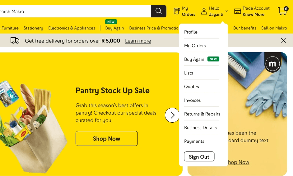
Homepage component now included product title to identify the exact product variant and had a CTA to take immediate action. More visibility was also given to view all which would lead to the Buy Again page
For logged in customers buy again link on header was given high priority
An entry point from profile was also added
A new tag was introduced to draw attention to buy again

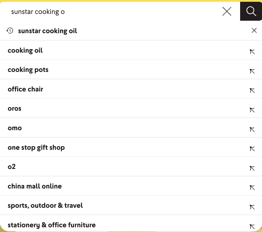
Suggestions while entering query


Before Search Starts: Give prompts for user to enact on. Showcase a carousel with previously purchased items shown
During Search: Prioratize previously bought item queries. Signal to user this was bought previously. Month was added for added recall value of context when it was bought. If it was a product specific search users could also add directly from search
Organically prioratizing previous purchases if it closely matches user searches or in a particular category
Item prioratization = Combination of purchase history + purchase frequency + relevance to search query or category
On product details page providing full context of when this product was purchased
Adding a carousel with previously purchased items

Created buy again as a shoppable page based on user test result preference as customers find the products more accessiblea and familiar to the usual shopping pattern
Entry point into subscription model- a new idea that would be relevant for B2B allowing users the flexibility of reorder without having to put the effort everytime
Business Value Proposition of subscription conveyed upfront as well on banner
In addition, the stepper method is the easiest to add multiple of a product making bulk purchases easier with all options at users disposal
Entry point to reorder to cater to the minority users who want to reorder at an order basis
Filters and sort options added for a conveniant browsing experience like PLP
Smart Saver Option gives intuitively calculates what purchase option is best for them utilizing previous purchase history for that product
Smart Saver Tip

Show deals beneficial to user based on purchase history

On click of reorder user gets. a view of what products are being added
User can easily modify items to be added and their quantity through the addition of a checkbox and stepper respectively
The manual effort and disconnect of having to go to cart to reorder is resolved here


📢 Cart and Communications
Adding a section nudging user to view custom suggestions. This will include a combination of previous purchases and personalized suggestions for users
Coupon for Offline to first time online customers adding a nice omnichannel touch
Adding a personalised carousel at cart where users have high probability of adding the product
Utilising the current infrastructure of email and messaging to inform users of previously bought products and sending reminders in case of inactivity
Nudge on cart

Intuitive suggestions right when user is thinking "what have I missed"?


E-mails and communications to entice you and always keep you in the loop